My Role
(Systems thinking with product sense) Design System, Product Design, Visual Exploration, & Motion Direction
The Creative Team
2 Creative Directors, 2 Systems Designers, 1 Visual Designer, 1 UX, 1 Motion
Google Cloud • Senior Product & System Designer •
2026
My Role
(Systems thinking with product sense) Design System, Product Design, Visual Exploration, & Motion Direction
The Creative Team
2 Creative Directors, 2 Systems Designers, 1 Visual Designer, 1 UX, 1 Motion
Client Testimonial
system updates to core library
of most used components updated
shared system mental model
hours saved per designer per quarter
The Challenge
The legacy CMS slowed page creation and fragmented visual consistency, so teams filled the gaps with custom modules. Existing components got stretched past what they were built for, a stats module meant for a single number ended up holding a full sentence. Cloud Next gave us six months to modernize foundations, align with GM3, and close the gap between design and engineering.
The Ask: Create a design system that is a reflection of Google Cloud’s innovation, unified under a scalable system.
Discovering Opportunities
The audit pointed to three priorities: flexibility, velocity, and documentation. We suggested a bottom-up, atomic approach, supporting consistent, scalable foundations and an incremental build.

Update components to GM3 and Cloud standards, build modules that flex instead of multiply, and add animation so the system finally feels like part of Google again.
Introduce image and video-forward heroes and storytelling moments, built responsive from the start, to bring content to life.
Give marketers self-service templates with smart defaults and clear guidance, so teams can move fast without losing consistency.
Plan, Design, & Execute
Every module starts with the same question: refine, extend, or build new? We mapped content to what already existed, stretched a module before we replaced it, and only designed something new when the need was strong. GM3 styles, spacing, and typography carried through the whole process.
Next, we built low, medium, and high LOE options for each module. Google Cloud could flag what needed attention, dev had a fallback when scope got tight.
Small refinements that improve clarity and cohesion without significantly altering the layout or affecting schema.

Moderate updates to flow, hierarchy, and messaging, with edits or new modules that refine content and may extend schema.

Significant redesigns that transform content, visuals, and interaction patterns to create a fresh, differentiated experience.


The hero image was too large and abstract to feel impactful, pushed the next module down the page, and read at a glance as a wall of text.
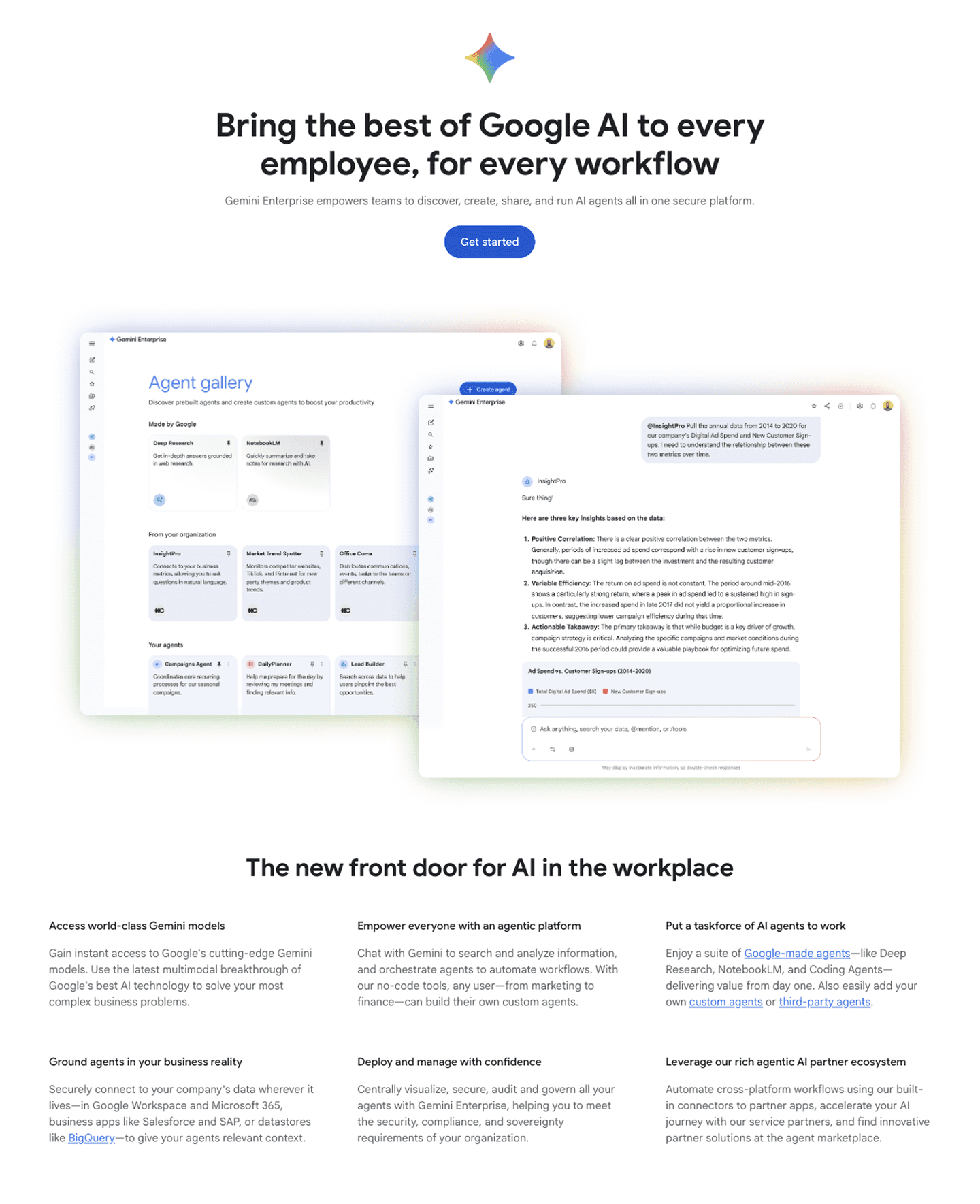
Made the hero smaller with high-impact messaging and reduced content, giving more above the fold.

Created dynamic, playful imagery and further reduced content, making it easy to absorb quickly.
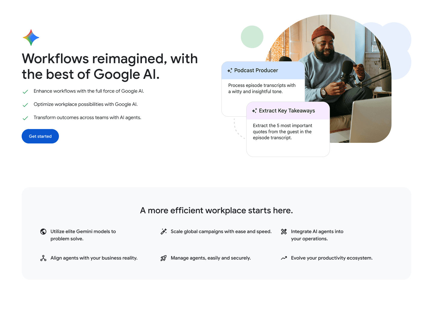

Motion & Mobile Examples
Elevated the hero component and brought in micro animations to immediately captivate.
Utilized shared components across all updated designs to bring unity to each page.
Modernized the existing 50/50 components and expanded dark and light options, using dark mode for focal moments.

↕️ Old layout (scroll to compare)

↕️ New design (scroll to compare)
Focused on image and video-based customer stories for stronger engagement and impact.
Enhanced story-telling components and muted supporting detail-oriented components.
Modernized existing components while updating to GM3.

↕️ Old layout (scroll to compare)

↕️ New design (scroll to compare)
Redesigned the hero section to highlight key benefits instantly using a smaller, higher-impact visual.
Simplified content to help streamline hierarchy and time on page metrics.
Reworked the pricing cards to read better for comparison scanning.

↕️ Old layout (scroll to compare)

↕️ New design (scroll to compare)
Design System Thinking
At its core, this was a systems problem. With the stories decided, I turned to execution, auditing what each page actually needed, testing existing components against those needs, and updating the underlying foundations wherever they fell short. Every shipped page became a live test of whether the system's decisions actually held up.

Constraints & Trade-offs
Close collaboration during production revealed how system decisions held up in real implementation and exposed deeper patterns in how modules were being used. This phase surfaced a key insight about the system’s next evolution.
Swipe ↔
KEY CONSTRAINT
TRADEOFF
Fix design system for Cloud Next launch with 3 months for design
Focused scope to three priority pages to validate system decisions in real contexts
Unclear how well referenced the existing base styles were and how they were implemented across the site
Used GM3 as the reference for scoped typography and spacing updates site-wide, testing readiness before a full rollout
Inconsistent module implementations and unclear system hierarchy
Refreshed full page experiences instead of isolated components to surface systemic issues
The legacy CMS made new fields, rich text, and video hard to add, so building a new module was often faster than extending an existing one
Designed nested components with ideal-state of available fields and options in Figma. Shipped within CMS limitations
Key Constraint
Tradeoff
Fix design system for Cloud Next launch with 3 months for design
Focused scope to three priority pages to validate system decisions in real contexts
Unclear how well referenced the existing base styles were and how they were implemented across the site
Used GM3 as the reference for scoped typography and spacing updates site-wide, testing readiness before a full rollout
Inconsistent module implementations and unclear system hierarchy
Refreshed full page experiences instead of isolated components to surface systemic issues
The legacy CMS made new fields, rich text, and video hard to add, so building a new module was often faster than extending an existing one
Designed nested components with ideal-state of available fields and options in Figma. Shipped within CMS limitations
Insights & Reflection
Our investigation revealed how small configuration gaps led to module sprawl, with many similar modules differing only slightly in fields. This made reuse difficult and slowed page creation. While not addressed in this phase, this insight now defines the system’s next evolution. Consolidation over expansion.
Motion & Mobile Examples
Videos may vary slightly—prototypes, motion explorations, or live site recordings
Videos may vary slightly—prototypes, motion explorations, or live site recordings
Videos may vary slightly—prototypes, motion explorations, or live site recordings
My Role
(Systems thinking with product sense) Design System, Product Design, Visual Exploration, & Motion Direction
The Creative Team
2 Creative Directors, 2 Systems Designers, 1 Visual Designer, 1 UX, 1 Motion
My Role
(Systems thinking with product sense) Design System, Product Design, Visual Exploration, & Motion Direction
The Creative Team
2 Creative Directors, 2 Systems Designers, 1 Visual Designer, 1 UX, 1 Motion
Google Cloud • Senior Product & System Designer •
2026
My Role
(Systems thinking with product sense) Design System, Product Design, Visual Exploration, & Motion Direction
The Creative Team
2 Creative Directors, 2 Systems Designers, 1 Visual Designer, 1 UX, 1 Motion
Client Testimonial
system updates to core library
of most used components updated
shared system mental model
hours saved per designer per quarter
The Challenge
The legacy CMS slowed page creation and fragmented visual consistency, so teams filled the gaps with custom modules. Existing components got stretched past what they were built for, a stats module meant for a single number ended up holding a full sentence. Cloud Next gave us six months to modernize foundations, align with GM3, and close the gap between design and engineering.
The Ask: Create a design system that is a reflection of Google Cloud’s innovation, unified under a scalable system.
Discovering Opportunities
The audit pointed to three priorities: flexibility, velocity, and documentation. We suggested a bottom-up, atomic approach, supporting consistent, scalable foundations and an incremental build.
Update components to GM3 and Cloud standards, build modules that flex instead of multiply, and add animation so the system finally feels like part of Google again.
Introduce image and video-forward heroes and storytelling moments, built responsive from the start, to bring content to life.
Give marketers self-service templates with smart defaults and clear guidance, so teams can move fast without losing consistency.
Plan, Design, & Execute
Every module starts with the same question: refine, extend, or build new? We mapped content to what already existed, stretched a module before we replaced it, and only designed something new when the need was strong. GM3 styles, spacing, and typography carried through the whole process.
Next, we built low, medium, and high LOE options for each module. Google Cloud could flag what needed attention, dev had a fallback when scope got tight.
Small refinements that improve clarity and cohesion without significantly altering the layout or affecting schema.
Moderate updates to flow, hierarchy, and messaging, with edits or new modules that refine content and may extend schema.
Significant redesigns that transform content, visuals, and interaction patterns to create a fresh, differentiated experience.
The hero image was too large and abstract to feel impactful, pushed the next module down the page, and read at a glance as a wall of text.
Made the hero smaller with high-impact messaging and reduced content, giving more above the fold.
Created dynamic, playful imagery and further reduced content, making it easy to absorb quickly.
Motion & Mobile Examples
Elevated the hero component and brought in micro animations to immediately captivate.
Utilized shared components across all updated designs to bring unity to each page.
Modernized the existing 50/50 components and expanded dark and light options, using dark mode for focal moments.
↕️ Old layout (scroll to compare)
↕️ New design (scroll to compare)
Focused on image and video-based customer stories for stronger engagement and impact.
Enhanced story-telling components and muted supporting detail-oriented components.
Modernized existing components while updating to GM3.
↕️ Old layout (scroll to compare)
↕️ New design (scroll to compare)
Redesigned the hero section to highlight key benefits instantly using a smaller, higher-impact visual.
Simplified content to help streamline hierarchy and time on page metrics.
Reworked the pricing cards to read better for comparison scanning.
↕️ Old layout (scroll to compare)
↕️ New design (scroll to compare)
Design System Thinking
At its core, this was a systems problem. With the stories decided, I turned to execution, auditing what each page actually needed, testing existing components against those needs, and updating the underlying foundations wherever they fell short. Every shipped page became a live test of whether the system's decisions actually held up.
Constraints & Trade-offs
Close collaboration during production revealed how system decisions held up in real implementation and exposed deeper patterns in how modules were being used. This phase surfaced a key insight about the system’s next evolution.
Swipe ↔
KEY CONSTRAINT
TRADEOFF
Fix design system for Cloud Next launch with 3 months for design
Focused scope to three priority pages to validate system decisions in real contexts
Unclear how well referenced the existing base styles were and how they were implemented across the site
Used GM3 as the reference for scoped typography and spacing updates site-wide, testing readiness before a full rollout
Inconsistent module implementations and unclear system hierarchy
Refreshed full page experiences instead of isolated components to surface systemic issues
The legacy CMS made new fields, rich text, and video hard to add, so building a new module was often faster than extending an existing one
Designed nested components with ideal-state of available fields and options in Figma. Shipped within CMS limitations
Key Constraint
Tradeoff
Fix design system for Cloud Next launch with 3 months for design
Focused scope to three priority pages to validate system decisions in real contexts
Unclear how well referenced the existing base styles were and how they were implemented across the site
Used GM3 as the reference for scoped typography and spacing updates site-wide, testing readiness before a full rollout
Inconsistent module implementations and unclear system hierarchy
Refreshed full page experiences instead of isolated components to surface systemic issues
The legacy CMS made new fields, rich text, and video hard to add, so building a new module was often faster than extending an existing one
Designed nested components with ideal-state of available fields and options in Figma. Shipped within CMS limitations
Insights & Reflection
Our investigation revealed how small configuration gaps led to module sprawl, with many similar modules differing only slightly in fields. This made reuse difficult and slowed page creation. While not addressed in this phase, this insight now defines the system’s next evolution. Consolidation over expansion.
Motion & Mobile Examples
Videos may vary slightly—prototypes, motion explorations, or live site recordings
Videos may vary slightly—prototypes, motion explorations, or live site recordings
Videos may vary slightly—prototypes, motion explorations, or live site recordings
My Role
(Systems thinking with product sense) Design System, Product Design, Visual Exploration, & Motion Direction
The Creative Team
2 Creative Directors, 2 Systems Designers, 1 Visual Designer, 1 UX, 1 Motion
My Role
(Systems thinking with product sense) Design System, Product Design, Visual Exploration, & Motion Direction
The Creative Team
2 Creative Directors, 2 Systems Designers, 1 Visual Designer, 1 UX, 1 Motion
Google Cloud • Senior Product & System Designer •
2026
My Role
(Systems thinking with product sense) Design System, Product Design, Visual Exploration, & Motion Direction
The Creative Team
2 Creative Directors, 2 Systems Designers, 1 Visual Designer, 1 UX, 1 Motion
Client Testimonial
system updates to core library
of most used components updated
shared system mental model
hours saved per designer per quarter
The Challenge
The legacy CMS slowed page creation and fragmented visual consistency, so teams filled the gaps with custom modules. Existing components got stretched past what they were built for, a stats module meant for a single number ended up holding a full sentence. Cloud Next gave us six months to modernize foundations, align with GM3, and close the gap between design and engineering.
The Ask: Create a design system that is a reflection of Google Cloud’s innovation, unified under a scalable system.
Discovering Opportunities
The audit pointed to three priorities: flexibility, velocity, and documentation. We suggested a bottom-up, atomic approach, supporting consistent, scalable foundations and an incremental build.
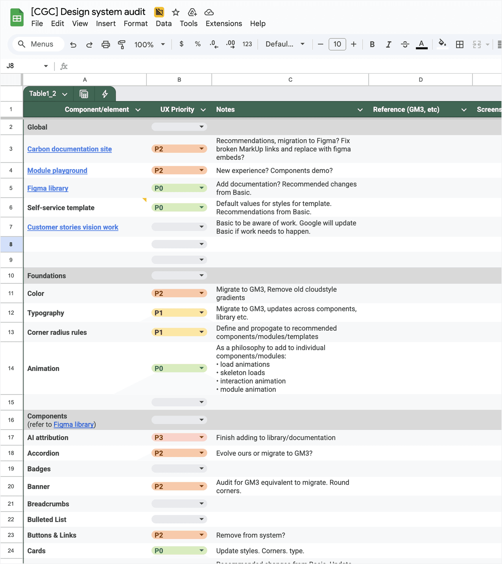
Update components to GM3 and Cloud standards, build modules that flex instead of multiply, and add animation so the system finally feels like part of Google again.
Introduce image and video-forward heroes and storytelling moments, built responsive from the start, to bring content to life.
Give marketers self-service templates with smart defaults and clear guidance, so teams can move fast without losing consistency.
Plan, Design, & Execute
Every module starts with the same question: refine, extend, or build new? We mapped content to what already existed, stretched a module before we replaced it, and only designed something new when the need was strong. GM3 styles, spacing, and typography carried through the whole process.
Next, we built low, medium, and high LOE options for each module. Google Cloud could flag what needed attention, dev had a fallback when scope got tight.
Small refinements that improve clarity and cohesion without significantly altering the layout or affecting schema.
Moderate updates to flow, hierarchy, and messaging, with edits or new modules that refine content and may extend schema.
Significant redesigns that transform content, visuals, and interaction patterns to create a fresh, differentiated experience.
The hero image was too large and abstract to feel impactful, pushed the next module down the page, and read at a glance as a wall of text.
Made the hero smaller with high-impact messaging and reduced content, giving more above the fold.
Created dynamic, playful imagery and further reduced content, making it easy to absorb quickly.
Motion & Mobile Examples
Elevated the hero component and brought in micro animations to immediately captivate.
Utilized shared components across all updated designs to bring unity to each page.
Modernized the existing 50/50 components and expanded dark and light options, using dark mode for focal moments.
↕️ Old layout (scroll to compare)
↕️ New design (scroll to compare)
Focused on image and video-based customer stories for stronger engagement and impact.
Enhanced story-telling components and muted supporting detail-oriented components.
Modernized existing components while updating to GM3.
↕️ Old layout (scroll to compare)
↕️ New design (scroll to compare)
Redesigned the hero section to highlight key benefits instantly using a smaller, higher-impact visual.
Simplified content to help streamline hierarchy and time on page metrics.
Reworked the pricing cards to read better for comparison scanning.
↕️ Old layout (scroll to compare)
↕️ New design (scroll to compare)
Design System Thinking
At its core, this was a systems problem. With the stories decided, I turned to execution, auditing what each page actually needed, testing existing components against those needs, and updating the underlying foundations wherever they fell short. Every shipped page became a live test of whether the system's decisions actually held up.
Constraints & Trade-offs
Close collaboration during production revealed how system decisions held up in real implementation and exposed deeper patterns in how modules were being used. This phase surfaced a key insight about the system’s next evolution.
Swipe ↔
KEY CONSTRAINT
TRADEOFF
Fix design system for Cloud Next launch with 3 months for design
Focused scope to three priority pages to validate system decisions in real contexts
Unclear how well referenced the existing base styles were and how they were implemented across the site
Used GM3 as the reference for scoped typography and spacing updates site-wide, testing readiness before a full rollout
Inconsistent module implementations and unclear system hierarchy
Refreshed full page experiences instead of isolated components to surface systemic issues
The legacy CMS made new fields, rich text, and video hard to add, so building a new module was often faster than extending an existing one
Designed nested components with ideal-state of available fields and options in Figma. Shipped within CMS limitations
Key Constraint
Tradeoff
Fix design system for Cloud Next launch with 3 months for design
Focused scope to three priority pages to validate system decisions in real contexts
Unclear how well referenced the existing base styles were and how they were implemented across the site
Used GM3 as the reference for scoped typography and spacing updates site-wide, testing readiness before a full rollout
Inconsistent module implementations and unclear system hierarchy
Refreshed full page experiences instead of isolated components to surface systemic issues
The legacy CMS made new fields, rich text, and video hard to add, so building a new module was often faster than extending an existing one
Designed nested components with ideal-state of available fields and options in Figma. Shipped within CMS limitations
Insights & Reflection
Our investigation revealed how small configuration gaps led to module sprawl, with many similar modules differing only slightly in fields. This made reuse difficult and slowed page creation. While not addressed in this phase, this insight now defines the system’s next evolution. Consolidation over expansion.
Motion & Mobile Examples
Videos may vary slightly—prototypes, motion explorations, or live site recordings
Videos may vary slightly—prototypes, motion explorations, or live site recordings
Videos may vary slightly—prototypes, motion explorations, or live site recordings
My Role
(Systems thinking with product sense) Design System, Product Design, Visual Exploration, & Motion Direction
The Creative Team
2 Creative Directors, 2 Systems Designers, 1 Visual Designer, 1 UX, 1 Motion
My Role
(Systems thinking with product sense) Design System, Product Design, Visual Exploration, & Motion Direction
The Creative Team
2 Creative Directors, 2 Systems Designers, 1 Visual Designer, 1 UX, 1 Motion